Finally replacing the ugly black bar and continuing on their bulky design look:
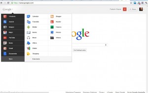
On Wednesday, Google presented its new layout for their homepage, replacing with a hover over pop-up list their not so pretty black bar.
“Instead of the horizontal black bar at the top of the page, you’ll now find links to your services in a new drop-down Google menu nested under the Google logo,” writes technical lead Eddie Kessler — whose Google profile identifies him as a “cat herder” — in an official announcement blog post. “We’ll show you a list of links and you can access additional services by hovering over the “More” link at the bottom of the list. Click on what you want, and you’re off.”
Described as the roll out of the Google Redesign, Google is experimenting a very bulky display, almost as if Android started invading PCs. No wonder this occures, those days everything should be though as a mobile first in Google.
Interesting that the aestehetic is not the best and is almost built as if the Google was creating a statement of their simplicity and usability. Perhaps a way to differentiate from Apple, even if they tend to use more and more similar shade of gray
2 min read
Categories
Recommended for you
21 October, 2025 by Selina Gough
Google Ads in AI Overviews: How AIO Affects Your Ads
Wondering how AIO affects your ads? If you’re running Google Ads in…
21 May, 2025 by Paul Hewett
Google IO 2025 Implications for Marketers
Google I/O 2025: AI Rewrites the Search Playbook – What Marketers Need…
14 January, 2025 by Marius Sprong

Our Expert SEO Advice to Ye for Yeezy.com
Last week Ye (AKA Kanye West) posted on Instagram to his over…
18 November, 2024 by Kirsten Tanner

The Future of Search in Travel Insights: Mumbrella Travel Marketing Summit Panel with Google & TikTok
During November (2024) we sponsored Mumbrella’s Travel Marketing Summit and hosted a…
25 July, 2024 by Paul Hewett
Google Won’t Kill 3P Cookies But its Users Will
Google has just announced that they won’t be killing off third-party cookies…
10 July, 2024 by Benoit Weber
Consent Mode Implementation: How to Install a Cookie Banner
Learn how to install a cookie banner and implement Consent Mode V2.…
19 June, 2024 by Frederic Chanut
Google Algo Leak: Summary of the Most Interesting Aspects
Summary of the Google Algorithm Leak The recent Google leak has provided…
22 May, 2024 by Marius Sprong
What would you do if your organic traffic disappeared tomorrow?
With the announcements coming out of Google I/O, is it time to…
17 April, 2024 by Benoit Weber

Don’t Lose Your Data: Google Analytics Data to be Deleted July 1
Don’t risk losing your data! Google Analytics or Universal Analytics data will…
