How many hours do you spend on reporting? Endless hours are spent every month, even every week, putting together reports for stakeholders such as senior management and external clients. These reports are important, as it is an opportunity to tell a story about performance, to showcase that money has been invested effectively and that more should be spent to further optimise existing campaigns or create new ones. In this article, we’ll show you how to streamline your reporting and build a data studio dashboard in 10 easy steps.
Streamline Your Reporting: How to Build a Data Studio Dashboard in 10 Steps
Many companies still follow outdated reporting procedures, where data remains disparate and different departments use different analytics platforms. There is rarely a centralised way of putting reports together and so it takes a lot of manual effort to extract, analyse and visualise the data to tell a compelling story about what is going on in the current digital environment. Given that performance is an ongoing story whereby the numbers change daily, it is important to find ways to streamline and automate the reporting processes where possible.
In Marketing We Trust is a Google Data Studio certified partner. Let’s look at the specific reasons why you should leverage the power of Google Data Studio.
The solution? Google Data Studio
Google Data Studio can help streamline the reporting process so that it is relatively quick and simple. According to Google,
“Data Studio turns your data into informative, easy to read, easy to share, and fully customizable dashboards and reports.”
It can connect to an array of data sources – not just Google Analytics.
By using Google Data Studio, you’ll save a lot of time when it comes to generating reports and will also ensure that your stakeholders will receive the right data at the right time. Once the reports are built, they can be automated to be sent to relevant stakeholders. The beauty of Google Data Studio is that all data is live. Also, it is very easy to amend an existing report if there are requests for more data or for the data to be visualised in a different way.
Why Use Google Data Studio?
There are 5 key reasons why you should try out Google Data Studio.
- It’s absolutely free
All that is required is a Google account and with it, you will have access to unlimited reports, users and it even supports 37 languages. - It’s simple to use
Data visualisation is highly customisable. Also, calculated dimensions and metrics can be easily included. - It’s dynamic
It uses live data and has many options for date selection, data filters and pagination. - It’s a time saver
It centralises data into one dashboard, providing you with the option to include multiple reports, data sources and platforms. It also enables real-time collaboration across teams. - It’s sharable
It is easily accessible for everyone. A report can be automatically sent to stakeholders, or those with permission can access the live URL.
The Art of Storytelling
Before choosing what data you want to include in your report, it is important to understand what problem your stakeholders are trying to solve. More often than not, our stakeholders may have a preconceived idea of what metrics to include. However, by understanding the true problem you are trying to solve through reporting, it will help you define additional metrics that should be included to tell a compelling story.
Don’t blindly report. Be critical and ask yourself:
- How will this report help solve my stakeholder’s business problem?
- What does my stakeholder hope to understand by reading this weekly/monthly/annual report?
As an example, by understanding that your stakeholder is wanting to understand sales performance for a product category (i.e. pet food), it will help you frame different ways of presenting the data. You may want to include the overall sales number and the associated revenue, but you will also think of additional ways to break this data further.
- What are our largest sales drivers?
- What are the areas we need to improve on?
This may lead you to break sales down by entry channel and device category and look at engagement metrics such as bounce rates. You may also seek to understand what the costs involved are behind the product offering (i.e. marketing activity, cost of the actual product, distribution etc.) and to see that weighted against the revenue generated, to understand true profit.
This scenario shows you that by understanding the true purpose of the report, it allows you to think more broadly than the metrics you will visualise in the report. You will be able to build a far more comprehensive and tailored report that addresses stakeholder needs.
10 Steps to Build a Google Data Studio Dashboard
Now that we know what data we want to use to tell the story, let’s build a simple report to demonstrate how easy it is to get started with building a dashboard.
- Create a new report
- Add data to the report and choose your connector
- Select the Google Analytics account and property
- Get familiar with the visualisation options
- Configure a data filter
- Add a visualisation chart
- Select the correct dimension and metric
- Create custom metrics
- Style your dashboard
- Share
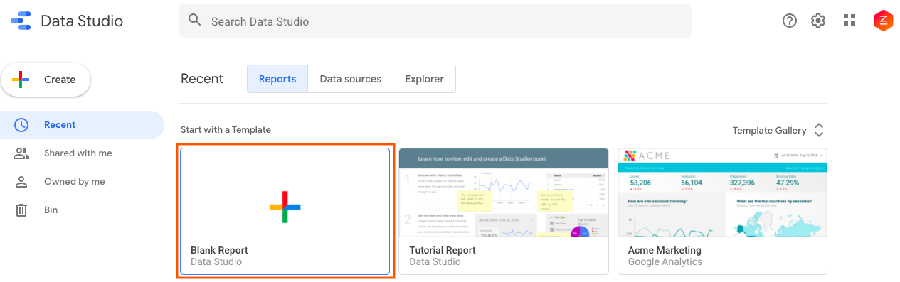
Step 1 – Create a New Report
- Go to https://datastudio.google.com/ and sign up (unless you already have a Google account).
- Click ‘Blank Report’
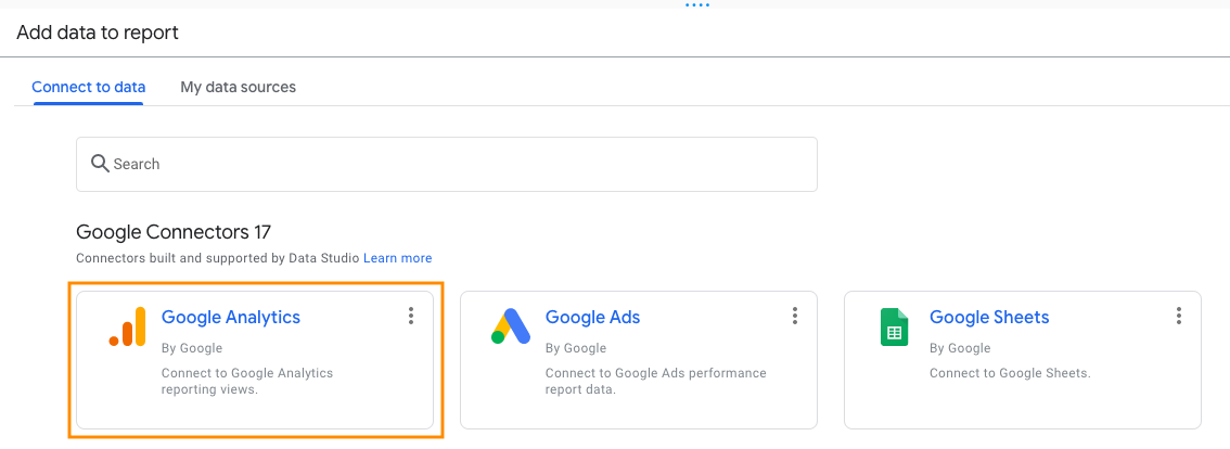
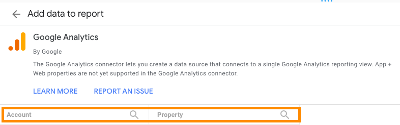
Step 2 – Add Data to the Report & Choose Your Connector
A window to ‘Add data to report’ will appear when you load a blank report. This is where you connect to the source of the data.
For this example, select Google Analytics to begin.
Note: You can add an array of different data sources (i.e. Google Ads, Google Search Console, Google Sheets).
Step 3 – Select the Account and Property
Once you have selected Google Analytics as a connector, select the relevant account and property.
If you have clients, you will see multiple accounts (and their respective properties) that you can choose from.
Step 4 – Get Familiar with the Visualisation Options
On the top menu, there are an array of options to visualise data. For the purposes of this example, we will create a bar chart displaying sessions over a specific reporting period.
Step 5 – Configure a Date Filter
The date filter is one of the most useful parameters with any given report.
![]()
Once you have selected the date filter, you can choose the parameters you want to set. There are multiple date filters you can pick from.
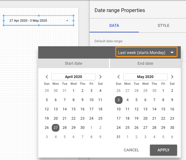
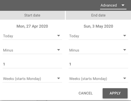
You can even customise your dates under the ‘Advanced’ Option.
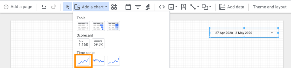
Step 6 – Add a Visualisation Chart
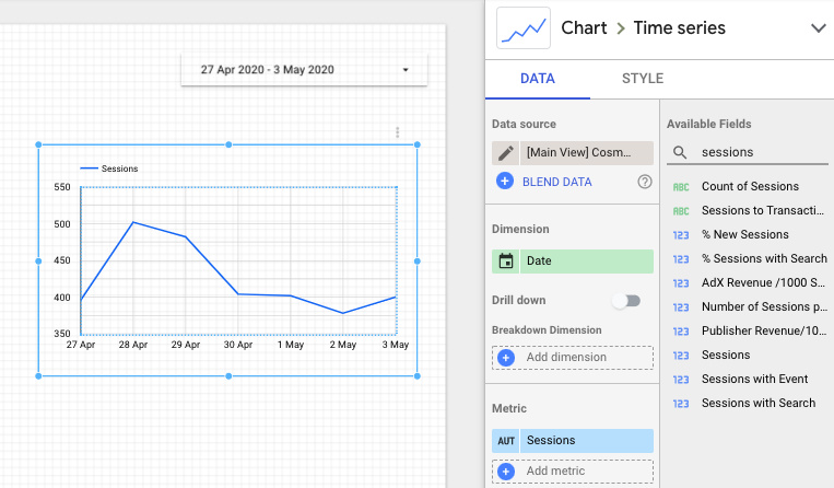
For this example, we will create a time series chart based on the number of sessions over the last week.
Step 7 – Select the Correct Dimension and Metric
As a time series chart, we want to plot the number of sessions over the last week.
This means that ‘Date’ needs to be selected as the dimension and ‘Sessions’ to be selected as the metric.
Notes:
- Dimensions are attributes of your data and offer ways to break data down further (i.e. date, device category, city, channel).
- Metrics are quantitative measurements (i.e. sessions, users, bounce rate).
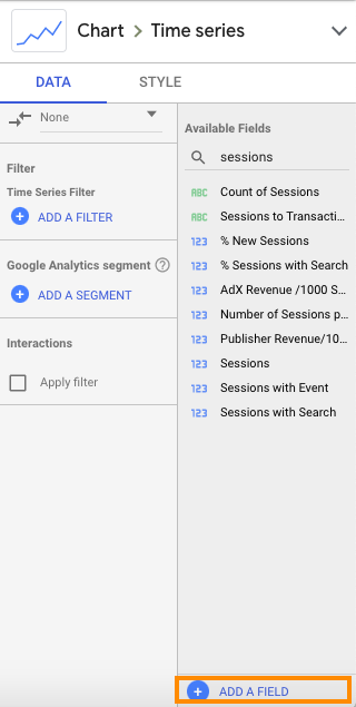
Step 8 – Create Custom Metrics
The flexibility of Google Data Studio is that it enables you to personalise metrics by editing each individual field. For example, if you would like to see a percentage of a number or calculate a completely unique number, you can do so by selecting ‘Add a Field’.
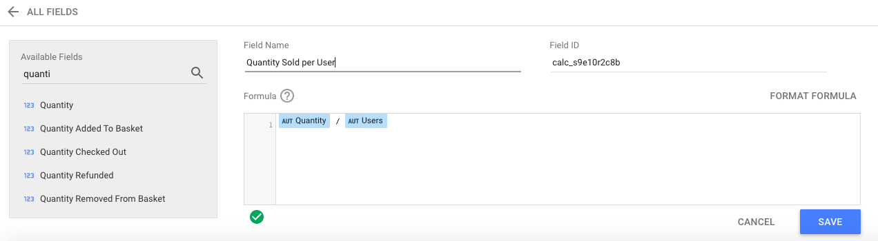
If you want to understand the quantity per user, you can select from the available fields and build out a calculation. For more information from Google on calculated metrics, access the data studio help centre.
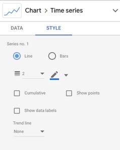
Step 9 – Style the Dashboard
There are multiple styling options to make your dashboard visually appealing and stand out. You can change colours, show data labels, show axis titles and much more.
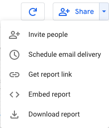
Step 10 – Share
There are multiple ways to share the report with stakeholders.
You can schedule email delivery or invite people directly to access the report.
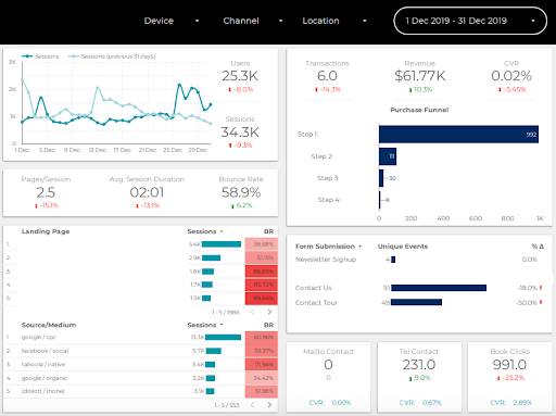
An Example of a Dashboard
Here is a dashboard that was created for a client. For privacy purposes, a lot of client-based information has been concealed. Note the different filters in the top menu, where you can select by device, channel, location or a specific date. This provides multiple options for users to delve into the data.
Streamline Your Reporting
Some of the key challenges of reporting have been streamlined with the advent of Google Data Studio. No longer are the days of exporting data from multiple sources and manipulating them in Excel. Creating interactive dashboards has been simplified with Data Studio, so have a go and try it out.
If you need help with your analytics reporting and dashboard, we can help you create customised dashboards using Data Studio to capture the metrics and dimensions that matter the most to you. Get a free consultation today.